I rarely rework projects. I revisit stories I wrote and enjoyed in my youth and write about them again, but that’s more out of a desire to go into those worlds than to see how much I’ve improved.
Many creative types make Then/Now posts, but I was neglecting to do the same.
I was doing myself a disservice. I was feeling guilt over neglecting my art, and fear that improvement wouldn’t be obvious.
Improvement has happened, despite the ugly things my inner critic tells me. This would become obvious after changing my site logo.
My site needed a refresh; it’s been over a year since I launched it and I wanted something more representative of me…..something I would be happy to use for a long time.
I sketched some concepts I had in mind, but ultimately rejected them. I needed something simpler. Cleaner.
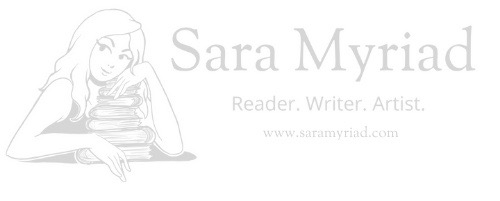
Looking at my original logo, I had the thought, “Well, duh Sara, why not just do that one again? You already know you like the concept.”
That’s exactly what I did.
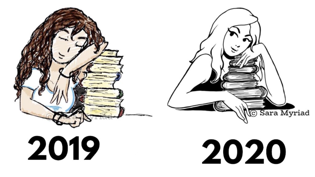
Making a side-by-side comparison of my work allowed me to see improvements I wouldn’t have noticed by looking at the art individually.
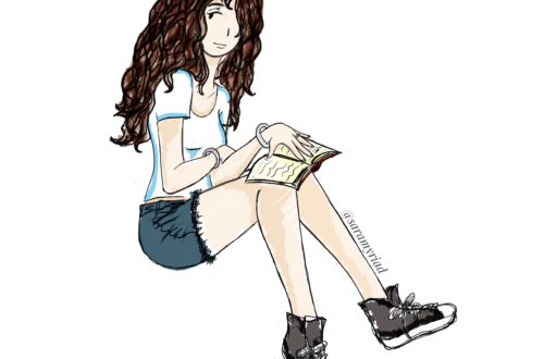
Working on this new drawing was electric. It’s the best kind of high, to sit down and work on something you enjoy, knowing in your bones it’s going to turn out beautifully. I sat for a moment after I completed her and just buzzed, happily, in my head. And when I put the two side by side, the tears came. Seeing my improvement laid out in a way that broached no argument was shocking.
Many people said they love the original, and I can’t discredit them, but there were definitely flaws. My outlines were scratchy; I defaulted to that style because I wasn’t yet comfortable outlining with a stylus. The anatomy in the arms and hands needed a lot of work. Perhaps most telling of all, her closed eyes spoke of a lack of confidence.
The new logo has bold, clean lines that were created with a sense of purpose. Her eyes are open, her gaze and smirk knowing. She lovingly nestles her stack of books in her arms. I played with the idea of little color accents on the book covers, but decided I just wanted to keep it monotone and elegant.
Artists chase the ideal of how they want their projects to come out. We never quite get there, but we have a hell of a good time trying.
Sometimes, what’s in our head actually turns out even better than we could have hoped, and doing an old project over is exactly what we need.
